OCBC
HACK-IT!
Creating a high-fidelity mock-up for cinema mobile app.
Role
UX Researcher
UI Designer
Project Teammate
Individual Contributor
Result
91.25% project score
Overall 3rd best project
Creating a high-fidelity mock-up for cinema mobile app.
UX Researcher
UI Designer
Individual Contributor
91.25% project score
Overall 3rd best project
Create a fully functional high fidelity mock up of a mobile application that allows users to book a seat in a movie theatre, with authentication required (email and password) before finalizing the booking.
This challenge had a timeline of 2 weeks.
The evaluation criteria was split into 4 equal-weighted components:
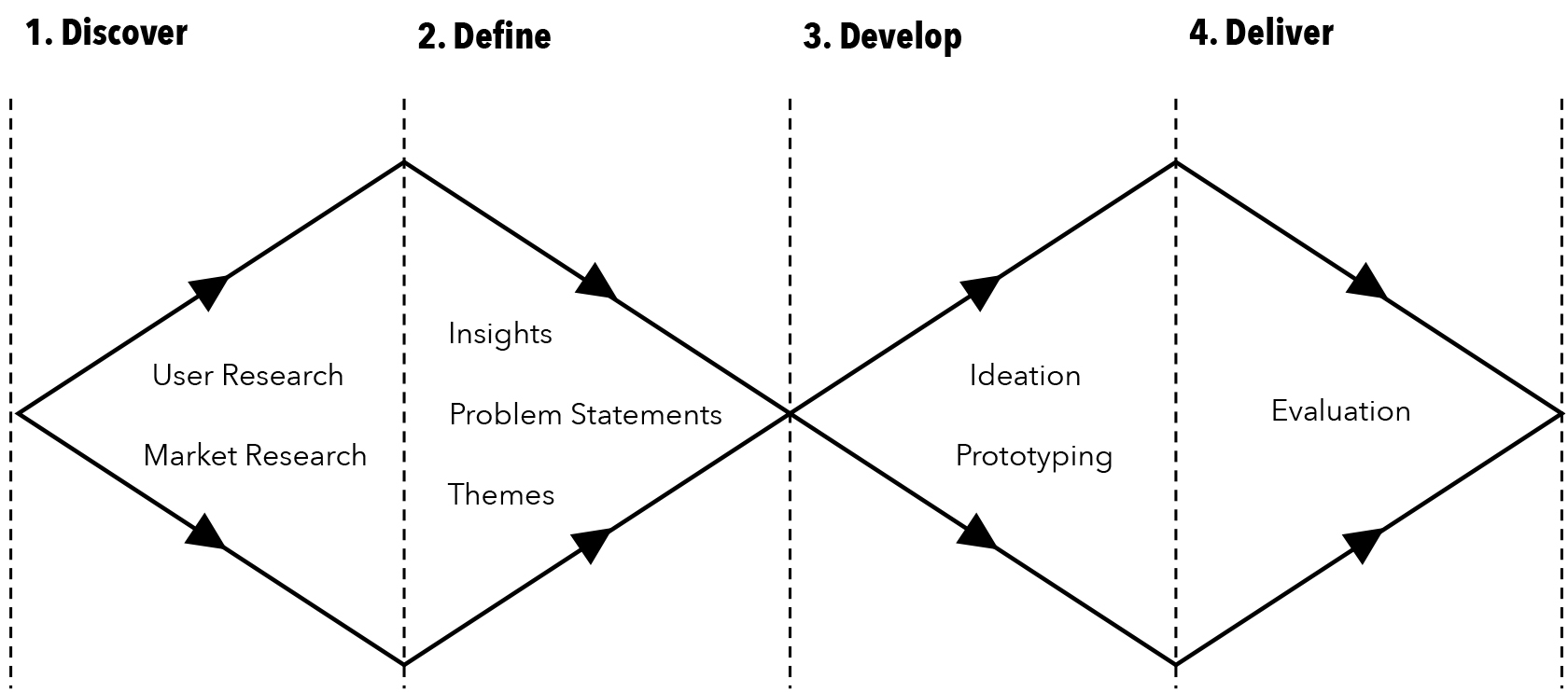
My design process for this challenge followed the double-diamond design model as a guiding framework.
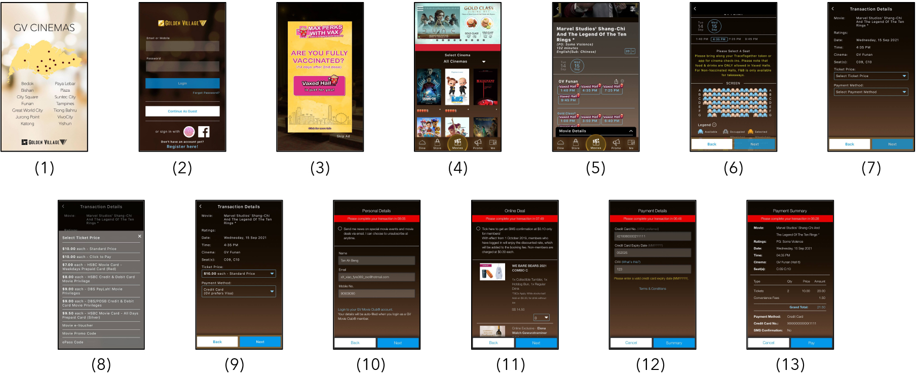
To better understand the existing solutions to movie booking in Singapore, I examined 3 mobile apps from popular cinema companies.
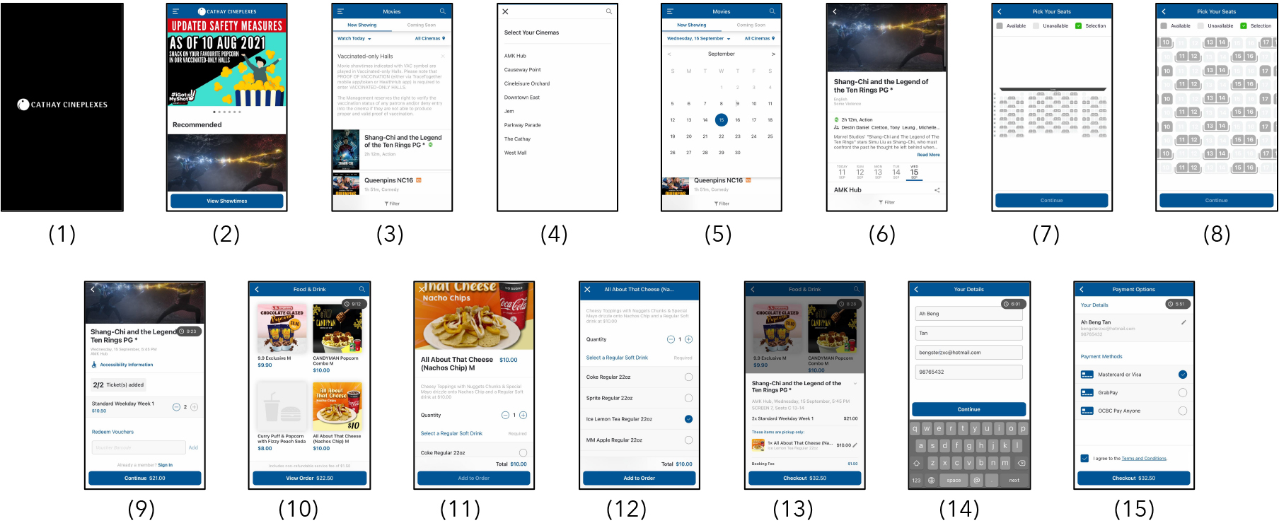
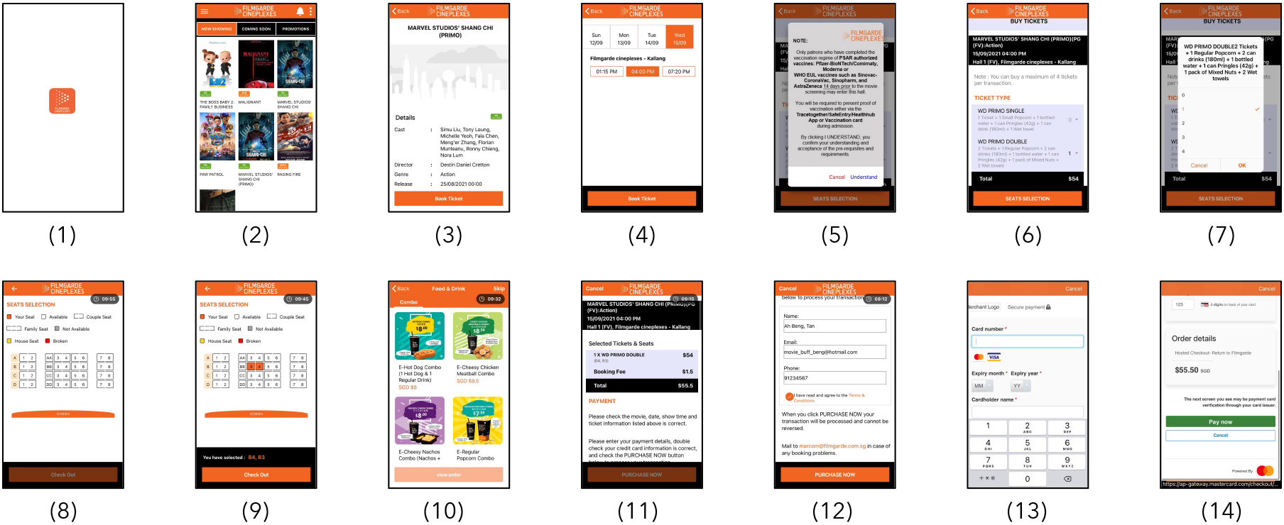
In examining the mobile apps of these 3 companies, I noted the number of different screens required in the user flow of the process for successfully booking a movie ticket.
The number of screens from launching the app until the completion of the movie booking is recorded below:
Golden Village: 13
Cathay Cineplex: 15
Filmgarde Cineplexes: 14
To better understand user needs and concerns when booking movie tickets with a mobile app, I conducted discovery sessions with 10 people, with ages ranging from 18 to 50+.
Each discovery session consisted of 2 parts:
Each participant was tasked with noting down their interactions with the app with the pre-defined goal of successfully booking 2 seats for a movie.
From the user interviews conducted with 10 respondents, 2 distinct groups of motivations for movie-goers were identified:
9 out of 10 of the participants interviewed have never used a mobile app to book tickets for a movie.
The reasons for not using a mobile app are:
1 out of 10 of the participants interviewed used a mobile app to book seats in a movie theatre.
The reasons for using the mobile app are:
The following pain points were identified from common themes raised during the user interviews:
Usability tests for the 3 cinema mobile apps were also done by the 10 interview participants. The participants were given the goal of booking 2 tickets for a movie, and noted down their thoughts for each step of the user journey.
The following findings were identified:
😡 Cognitive Load: Information Overload
Participants feedbacked that they felt overwhelmed by the information displayed on the selection screen for movie timings and locations.
Additionally, participants had to scroll a lot in order to view and compare timings from different cinema locations.
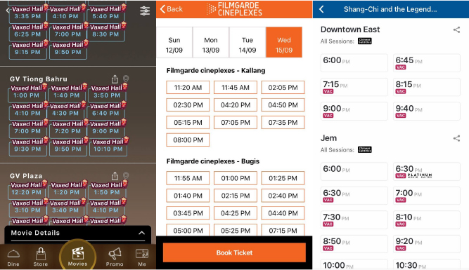
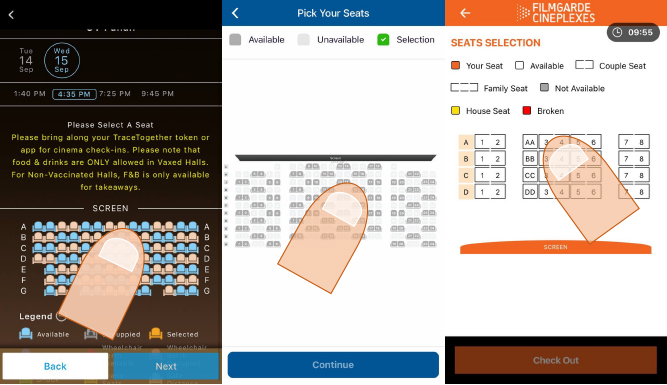
😡 Fitt's Law: Small Clickable Interface
Participants noted that the small size of the seats in the seat-selection screen was difficult to tap on, and this caused them to spend a longer time when selecting their desired seats in the cinema.
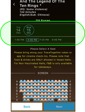
😊 User Control and Freedom
Participants appreciated that they could easily switch between various options should they change their minds, or want to compare movie dates and timings.
From the findings of the User Interviews and Usability Tests, the following problem statements are defined, along with "how might we" questions to help with ideation:
The following assumptions are made for the ideation and prototyping phases of the challenge:
Users are unable to filter movies by time-frame: How might we improve the selection process so that users can filter through movies easily?
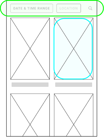
Users are overwhelmed by the information displayed when browsing the selection of movies, locations, and timings: How might we present all the information without users' cognitive overload?
Drawing inspiration from the Golden Village mobile app, I designed an interface which allowed users to easily view and select movie timings based on date and location.
Different sections are separated with visual hierarchy, and options within each section overflow and scroll horizontally.
Users are able to breakdown the information, processing it by sections, reducing cognitive load.
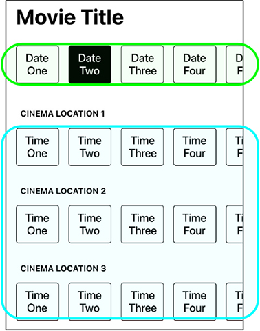
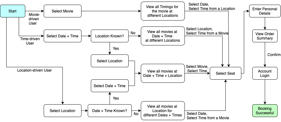
Users are frustrated by the long process for booking movie tickets through the mobile app: How might we shorten the user journey so that users can book their movie faster?
I designed a new user journey that shortened the number of screens needed to book movie tickets from an average of 14 screens to a new count of 7 (minimum) – 10 (maximum) screens.
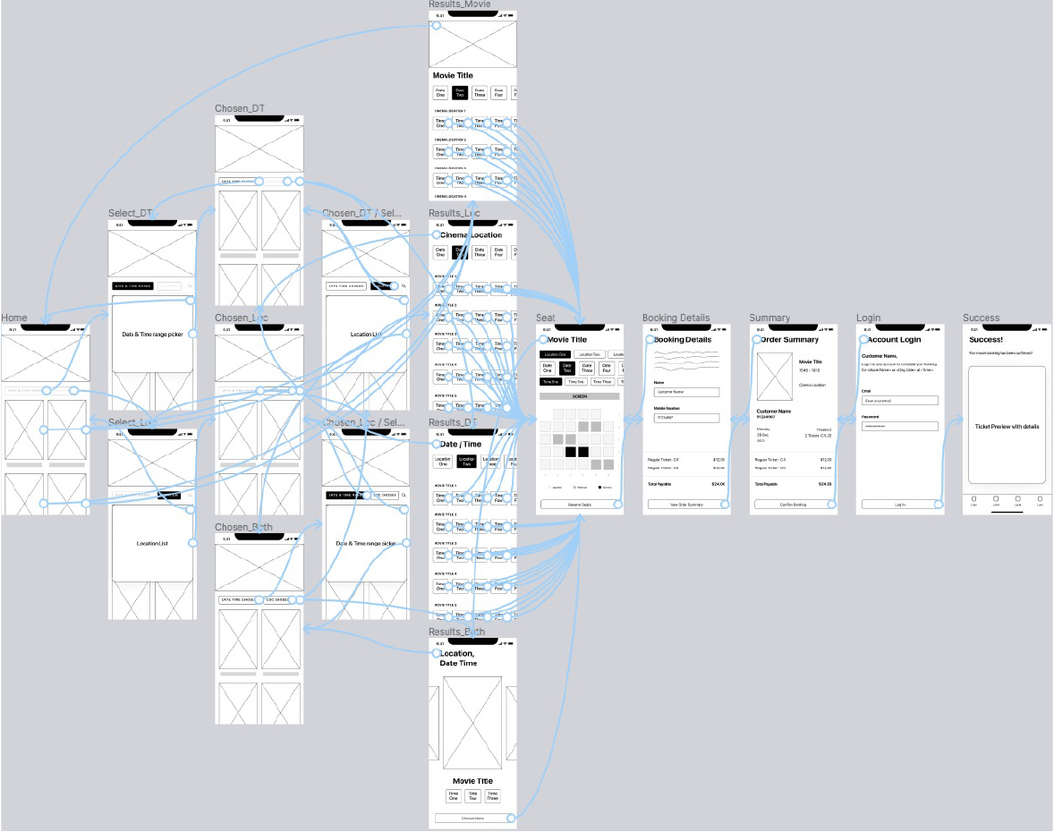
Previews of the Figma projects showing the user journey and interactions between various screens for both the low and high fidelity prototypes for the mobile app.
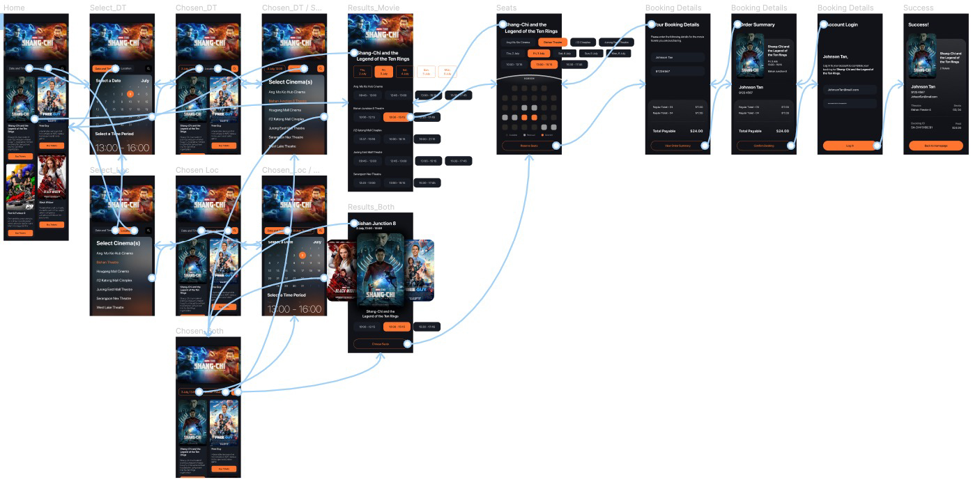
After the hi-fi prototype had been completed, I conducted quick user interviews and usability tests with 6 participants.
There were 2 main purposes for this round of user tests:
With respect to the 3 problem statements identified:
✅ Users are now able to filter by date, time, and location
✅ Users found the method of displaying information was less confusing and easier
✅ Users reacted positively to the noticeably shorter user journey to book a movie ticket
Design is an iterative process where a product’s cycle is (design, ship, test, analyze) and repeat.
Due to the 14 day limitation of the challenge, as well as it being a one-time assignment, new findings and feedback from interviewed participants were unable to be analyzed and implemented.
If worked on as an actual product, the mobile app would be constantly analyzed and iterated upon, like that of a true iterative product design cycle